Plan and Minimalist House Design Tips

Minimalist Home Designs

In building a house is minimalist, not easy as you imagine. many things to consider in building a minimalist home. the plan is a minimum. and interior space therein made to the minimum.

Minimalist house, there are only a few of my other family bird birds usually combined with sitting room, kitchen and living room there are only two bedrooms and a garage for one car only.

Minimalist house may not have a large yard for children to play, so that a child's room should be made as comfortable as possible. so that children feel relaxed in that space. I think quite a few tips from me to make a minimalist home.

Have you got a basement?

Have you got a basement at your house?
In my dream house plan we do have a downstairs area, that, could almost be classed as a basement really.
It will open at one end which will be the garage, providing enough space to park 2 cars. It will also open at the back of the house, which is the only place where we will have windows, the rest will be underground.


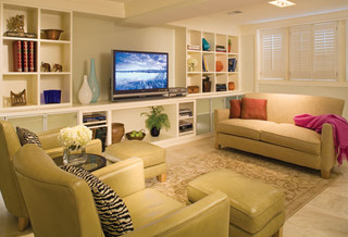
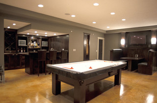
Finished Basement modern family room


We want to use part of the area for the kids activity room, so it needs to house a TV & desk area for computers, some shelving for books & toy storage.There will be a small bathroom down here as well.


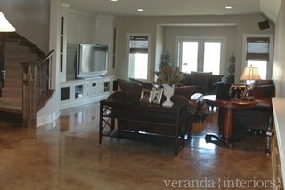
Basement rec room media room


We will also have a sofa bed here for guests to sleep on as we won't be having a guest bedroom.


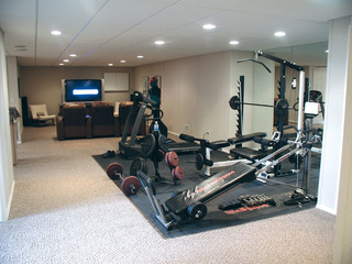
Basement Remodeling Projects executed by our TBF Dealers. eclectic


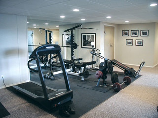
Basement Remodeling Projects executed by our TBF Dealers. eclectic


This is how I intend to use the rest of my basement space. I love owning my own exercise equipment & it gets used by my teenage daughters as well as myself (when Im not to busy blogging).
The challenge will be incorporating all of these uses into this space & still making it visually appealing.I would like to make it a relaxed & fun space as upstairs will have more of a formal feel to it!

I will be trying to create zones without blocking the natural light, seen as though we only have windows at one end of the room.
 There will obviously be a wall to close the garage off from this area.

Recreational Room contemporary media room


I'm sure this is what my dream guy would LIKE to see in the basement!!!

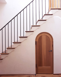
Ryan Associates - New Homes - Northern California Residence mediterranean staircase


Doesn't this cute door just make you want to take a peak inside....

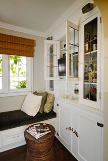
Leschi traditional family room


There is nothing like a window seat to add a feeling of cosiness.

The basement or downstairs area is all stuff that we will be completing after we move in, rather than paying our builder, as it adds to much onto the cost of the house. I am glad about this as I am a very visual person & feel I am going to need to see this area before I can design a decent layout for the furniture & gym equipment.

If you have any advice, ideas or images feel free to send them my way, I will be starting with a brick shell, plumbing for a bathroom & a stair case, so anything is possible.

Cheers
Trish xx

All images via Houzz

What is Architecture Minimalist? Minimalist House Design


The roots of minimalism in architecture is often traced back to the mid to late 1950s. Movement is a reaction to the new style of architecture - and lifestyle - which is being cultivated in the United States. In the U.S. boom in the years after World War II, there is a movement towards a large and exaggerated style of the building. During this era, groomed suburbs and supermarkets all over the map of the cave appeared, and there was a tendency garnish it. Minimalism was developed as a response to a lifestyle that increasingly commercial and consumer are reflected in the design.

Despite the minimalist art (which is sometimes known as a literalist art) has its roots in America, minimalist architecture was born elsewhere. Northern Europe, especially Scandinavia, and Japan is very important in the history of minimalist design, and in fact, this place remains one of the biggest embracers minimalism.

In general, the idea of minimalism can be described as "less is more," or as some designers and architects are fond of saying, "do more with less" minimalist architects use space as a design feature in and of itself .. Rather than attempting to fill the space with features, they create designs where space is as carefully thought out and used as the things they add to the room. basic shapes and straight, clean lines that are also important techniques used in minimalist designs, such as playing with various types of illumination. The result is elegant but not fussy.

Another technique often used is to provide a feature that more than one use. One example might be the floor beneath the heating unit, either form the basis for the room and heating room. This allows the designer to create the optimal utility without crowding the space.

Some of the important architects working in the field of minimalist design includes:
  • Lugdwig Mies van der Rohe
  • Buckminster Fuller
  • Dieter Rams
  • Luis Barragan
  • John Pawson
  • Eduardo Souto de Mouro
  • Alvar Siza
  • Tadao Ando
  • Alberto Campo Baeza
  • Yoshi Tanigushi
  • Peter Zumthor
  • Richard Gluckman
  • Michael Gabellini
  • Claudio Silverstrin
  • Vincent Van Duysen

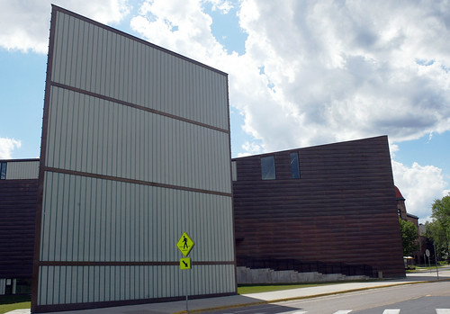
Architecture Design School with geometric facade

Architecture Design School,

Architecture Design School uses geometric facade. Belonging to the facade is a facade that this geometric apply geometric shapes such as boxes, circles, triangles, blocks, and cubes. Geometric forms and then mixed together so as to create an attractive facade forms.

Minimalist Contemporary Design House in Brazil

This is a contemporary minimalist house design in Brazil. This project is a contemporary minimalist house designed by Arthur Casas is located in Iparonga, Brazil. Cumaru wood exterior panels with a warm, House in Iporanga is an architect who lives in the forest. "I always wanted a house in the woods, in a place where I can relax and recharge" my energy, said Arthur, from Arthur Casas.
This house is in great shape two simple, symmetrical cubes embracing an open space. As explained, 'reinforces the lack of integration with the environment home partition and add grandeur to a minimalist living area. A limit of a large terrace house, serves as a corridor to observe the surrounding untouched Atlantic Rain Forest, and the partition between the natural and built. Resigned, inched unlimited pool seems to pour into the thick vegetation. "
Private room at the side of the cube around. On the upper floor accessed by a thin bed of floating Cumaru catwalk leading to the ultra-thin profile. To the left: the guest bedroom and a private guest room. To right: master with en suite.
Below is the kitchen and the waiter places to the left, the guest bedroom and office to the right. This office has two large picture windows east and south. This seating area to be shaded from the sun-centered summer, shining in the east and west through the door of this room a big wind.

Home Interior Design

A gorgeous bedroom


I stumbled across these pics of this extremely serene bedroom at Home & Garden & felt I should share it with you all!!!


I'm loving this very comfy looking chair, what better place to sit & enjoy the view....


2 beds !!!
 Does one belong to my sister or is it somewhere for my bestie to snuggle when she stays over....


Wouldn't it be lovely to wake up to this pretty blue ceiling!!!

A very subtle use of colour & pattern to create a pretty but versatile room that would suit any age.

A very inviting bedroom, don't you think ?

Landscape architecture schools with a unique building

landscape architecture schools,
Landscape architecture schools with a unique building

Landscape architecture schools with wood materials

landscape architecture schools

Landscape architecture schools with wood materials

Modern Minimalist Furniture for Minimalist Home Design

This is an example of modern furniture for home design minimalist. Minimalist modern furniture needed to fill a minimalist space in your home. modern theme makes the room should be designed with the latest furnishings. We will provide pictures and minimalist furniture that will adapt to the modern concept of your home. This furniture design is the latest design we got from several sources on the internet. Hope can help you with design ideas to add to your room.
Home Interior Design
Modern Minimalist Furniture for Minimalist Home DesignBathroom design
Bedroom design

Modern Bookcases

We've been struggling with the decision whether to buy an iPad or not.  We are late adopter, or maybe even no adopter, type when it comes to technology.  There is something about holding a book and flipping the pages that is really satisfying to us. 

That is, until you want to carry ten books with you when you travel.  And most of them are hardbacks. Times like that make us wonder if printed books are going the way of CDs, you know. Like, who buys CD anymore?

But as we were driving down the Melrose Design district the other day, this gorgeous bookcase from the Poliform showroom almost caused us to crash the car.  It is STUNNING!  It's huge and it's perfect if you have a loft with very tall ceiling.


We don't have the pricing information for this item, sorry.  Poliform is very high-end and upscale, so it is probably really expensive.  But, if you have a really good carpenter, it's probably really easy to build!  And, wouldn't it be great as a room divider too? Just make sure your carpenter anchor it properly.

You see, there is always a place for books! Ipad or no Ipad.

To see more bookcases from Poliform, click here.

Shower Shock Caffeinated Soap


Tired of waking up and having to wait for your morning java to brew? Are you one of those groggy early morning types that just needs that extra kick? Know any programmers who dont regularly bathe and need some special motivation? Introducing Shower Shock, the original and world's first caffeinated soap from ThinkGeek.

Shower Shock is an all vegetable based glycerine soap which does *not* contain any harsh ingredients like ethanol, diethanolamine, polyethylene glycol or cocyl isethionate. So it's a gently invigorating soap. Scented with peppermint oil and infused with caffeine anhydrous, each bar of Shower shock contains approximately 12 servings/showers per 4 ounce bar with 200 milligrams of caffeine per serving. No, we're not kidding and no you don't eat it. The caffeine is absorbed through the skin...

Shower Shock, which is currently available online, is scented with peppermint oil so you don't end up smelling like coffee. It's also infused with caffeine anhydrous and each bar of this soap contains approximately 12 servings/showers per 4 ounce bar with 200 milligrams of caffeine per serving. However, the manufacturers have warned that the soap is not recommended for pregnant women or children because of the caffeine content.

The caffeine in the 125-gram Shower Shock will last in your system for approximately four hours, the same as two cups of coffee. One bar of soap costs (US$6.99) which 10 bars cost (US $37.99)

Read Also:
Shower Shock Caffeinated Soap (ThinkGeek)
Bar of soap gives caffeine kick in the shower (Reuters)

Labels: bathroom, inventions


posted by Fahad Al Mahmood @ 12:08 UAE Local Time| Permanent Link

Washup: Washing Machine & Toilet Integrated


I smiled when I first saw the above picture. I've always thought there should be a better way to benefit from used water coming out from washer machines.

"Washup" is a conceptual design by Sevin Coskun from Turkey integrating washing machine with toilet flush. It suggests a sustainable water consumption by storing the wasted water in toilette-flush tank and reuse it with flushing. Moreover, "Washup" brings a solution for the problem of location of washing machines in small bathrooms, overlapping washing machine usage space with toilette usage space.

"Washup" is fixed on wall upwards toilet, so that loading of clothes would be easier for the user without bending or crouching. A special interface including three semi-sphere control units & two flushing buttons is designed for a practical usage of the product. "Washup" is a green product offering solutions for the problems of standard washing machines.

Read Also:
WASHUP (Core 77)

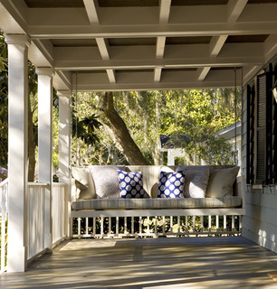
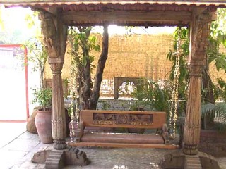
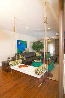
Come swing with me

I love the look of a swinging chair or day bed, whether indoors or out on the verandah they just scream relaxation to me. My parents have one in their outdoor entertaining area & it is loved by the adults as much as the kids.
Have you ever tried sitting on a swinging chair & been able to resist the urge to swing?
That gentle, rhythmic motion is irresistibly soothing.

Image via This old house


Image via My home ideas


source unknown

I dont think you need a view to get pleasure from a swinging chair, any location will do, BUT, a fabulous   out look would certainly heighten the experience! 

Porch traditional exterior
traditional exterior design by other metros architect Frederick + Frederick Architects


It would appear there is a style for every decor

adwait kher contemporary living room

Schriever Residence eclectic family room
source unknown

Image via savvy housekeeping

Source unknown
This is by far my favourite image, the colours are beautiful, the wall paper & rug are lovely, its very feminine & romantic, don't you think?

Five Ways to Make Your House Younger

Did you see "Hot In Cleveland" last week?  We didn't either, mainly because we don't even know how to find TV Land on our TV.  If you miss it, you can see the full episode here.

Anyway, the reason we mention it is because reading a LA Times review on the show we saw one funny line-- "To think we spent all that time and effort and money trying to look 10 years younger and 10 pounds lighter," says Malick, a recently unemployed soap star now being offered grandma roles, "and all we had to do was crash-land in Cleveland."

You'll have to be at that age to know what we are talking about!  You know, the age where we look at younger women more than our husbands do?  The age that we keep saying to ourselves, man, if I can only have my old body back with my current brain? 
Which leads us to this point, do you know your house can look 10 years younger too?  Most people don't realize this, but the way we decorate our house is very much like the way we dress, it literally can add or subtract a few years.

Here are five ways you can instantly update your home:

1) Use fresh and happy colors via use of wallpapers, paints and fabrics.

Wallpapers are so in now.  We love, love it.  Not as much to wallpaper every room like they did in the sixties, but by wallpapering just one wall or a small bathroom or dining room, you can instantly freshen things up.

Thibaut.com

2) Get rid of things that are outdated.

You know how mom's jean just add 10 years to your age and 10 lbs to your butt?  Outdated things like ivy silk plants, sofa arm covers, oak furniture, shabby chic sofas (so 80s!) are the equivalent of mom's jeans. Worse yet, it screams "grandma"!

3) Update your furniture

Furniture is like fashion.  It changes with time.   You probably notice that furniture are not as heavy as they use to be.  The heavy, ornate look for furniture (think Real Housewives of Orange County/New Jersey/Atlanta) are as out as McMansions.  Rather, look for furniture that are modern and clean-lined with fresh designs.  If you have upholtery pieces with good bones (say, a very comfortable sofa), consider re-upholstering it with new fabrics.  The fabric choices nowadays are amazing. 


4) Get small little things that count.

Sometimes things are so tough that shopping is not an option (2008-2009, anyone?). But you know how sometimes a little thing can make us feel much better, say, a tube of pretty lipstick? It's like that for the home too.  We spend so much time in our home, it's ok to treat yourself a little bit.  Little things like dressing your bed with really good sheets, make your bathroom like a spa etc.  goes a long way.  You see this with a good hotel--it's the little details that make all the difference.

So consider buying a new rug, a couple of pretty pillows--it doesn't have to be expensive.  Homegoods is a good store for bargains like this.  Buy lots of books secondhand.  They make you look smart (and  great accessories too).


Note:  A good source for hotel things is American Hotel Registry.  They sell actual hotel sheets, pillows and mattresses and from what we can see, the prices are pretty good and that you can buy directly from them.  (We are not affiliated with this site in anyway)

5) Go contrarian. 

The problem with trend is that after a while everything looks the same.  Remember how Juicy Couture was all the rage just a couple of years back?  What happened now to those velour tracksuits?

Home trends are like that too.  After a while everyone's house look the same.  Enough with the granite counter already.  Enough with one paint color for each room.  And please, do we need 10,000 square feet home?

The best styles are the ones that buck against the trend, stay true to the classic, and retain its integrity.

Go with your personality and your style, unless, of course, you have no style (in that case, consider hiring help).

Just remember that simpler is better, and less is more.

Masculine Furnishings for Men

Men usually don't have that much say in the decorating of your home, do they?  We think because if we leave it up to them all they will buy is big screen TVs and Lazy Boy chairs.   Say what you will about stereotype.  It exists because it's usually true.

So consider this a "Straight Women for Straight Guys" intervention. Furnishings can be very masculine and stylish at the same time.  Here are some of our favorite furniture lines that have that combination:

Thomas O'Brien for Hickory Chair:
This line is what we would describe as modern American classic. Very clean-lined. Solid, neutral colors. A little bit pricey, but it's the kind of furniture that won't go out of style for a long time.


Michael Weiss for Vanguard Furniture

This is another one of our favorite collection. Manly, but not overly so. There are some soft touches in the details that we like.  Less expensive than Thomas O'Brien, and the quality is just as nice.


Brownstone Furniture:

If you are looking for an affordable line with coordinating and matching items, Brownstone is a good choice. Very inexpensive. They just added a new upholstery collection, which is really nice.  We like the upholstery collection a lot more than the casegoods (industry term for wood pieces).


Bolier Furniture

If your man likes really, really simple, clean-lined things he'll like this line.  Pricey (more on the wood pieces than upholstery-the upholstery products are a bit more reasonable).  It could be a little severe (because it's all straight lines and geometric and muted colors).


As always, warm up these rooms with accessories--such as rugs, artwork, fresh flowers, books etc. We can't emphasize enough what a huge difference this would make.

Ultra Cool Barstool

We love this new modern barstool from Nuevo. It's so sleek!
The seat is upholstered in Italian leather and the base is a solid steel. Very substantial and heavy. The seat runs a bit small in size. Shown here in black, it is also available in white and brown leather. The base is hydraulic, which means you can adjust the seat heigh.

The price is $475.

Home Design Ideas on The Slopes

Home Design Ideas on the Slopes

Built on the beach with a steep slope sites, upper-level modern home is designed to maximize the panoramic sea views with stunning architectural roof forms leveling. Semi-arched roof is designed as an accent evocative of sea swell. leveling Space in the atmosphere relaxed lifestyle design with a simple color scheme and homogeneous, making this home perfect for holiday events. Designed by TT Architecture.


Home Interior Design
Examples of minimalist house design