Minimalist Home Design Beautiful with Natural Garden

Advertisements .

This is a beautiful minimalist house design with a combination of natural garden. This minimalist house design projects come from ideas to concrete homes combined with software components such as natural parks. Built at a location near the lake, A-Cero Architects make this house look so fantastic. Moreover, supported by the extension of green scattered in the general area of heritage.

Verandas and pergolas, as volumetric elements such as housing, giving the facade of personality. Concluding like turned into a flat roof disappeared as an expression of the evolution of the creative process. Purity of the forms move into a constructive scheme, with the material and the environment impelling union between buildings and the context where it is located.


Exterior home design minimalist with natural garden.

Read More

September Love

Advertisements .


My favorite month of the year is September. I love this month so much that if I were in charge of making the calendar, I would make two Septembers. I enjoy the month partly because it's the month of my birth and the onset of my favorite season. It's the beginning of a new school year and when the outside temperatures begin to feel perfect.
To me September signifies a fresh start.
A few years ago I joined the crowd and put up all of my fall decorations at the beginning of September. But I discovered that I prefer to ease into the season, much the way Mother Nature does, just a little at a time. This way I can savor my favorite month of the year.

What month would you like to repeat each year?

Read More

Home Design Minimalist Mix Box

Advertisements .

This is a minimalist house design Box Mix, designed by Manuel Marquez. Mexican architect brings a simple yet full of innovative ideas. Simple shapes with remarkable composition make this project feasible for discussion.

Corner building site in the middle-class neighborhood. This site has only 2150 sq ft. The developer intended to build two small single house but after reviewing the rules of our city to realize that an apartment building is much more profitable. And we can even attach a small commercial space.

The premise of the building is to provide maximum privacy and independence for each unit. We are located at the corner commercial space is and so we separate the garage and access to both units. The building is a pile of boxes, each one on top of each other, with different size and rotation. The volume creates a series of terraces. Inner space is a "cross-connected" so that both units share all stories and a terrace. The result is a very unusual apartment building.

Read More

Villa Eco Green Environment Design By TWS Partners

Advertisements .

Villa design viewed from above
Home designs interior
Bedroom in villa design
Bathroom design in villa
Eco Green Environment Design Villa at night

Eco Villa is located in the oil palm plantation near Kuala Lumpur, Malaysia, Tonny Wirawan Suriajaja as founder TWS Partners offers several innovations in design. This project brings the concept of the Green Ecological been the trend recently. We can see the beautiful garden on the roof of this villa which briefly describes the concept of green environment.

The project is located in the oil palm plantations, in the district of Shah Alam, 15 minutes drive from Kuala Lumpur. The location where the building is located is part of a satellite city master plan, which consists of housing, and other supporting facilities, named Setia Eco Park. This development brings the concept of Green Environment, in site planning, dedicated to the upper middle class market.

client brief was to create, unique modern, sustainable style of architecture without leaving the tropical aspect as a starting point. Site itself is part of an integrated mixed use master plan and housing function, called ECO PARK FAITHFUL, who brought the concept of GREEN ENVIRONMENTAL, in their design concepts, and are intended for sale to the secondary market.

Design brief comes from the client to create a residential environment that will reflect the architectural style of Asian modernity without abandoning tropical aspects as design constraints.

Derived from a client brief, we decided to play an additive form generator to create mass and, within the same functional space as well. Space in the room was analogize in pure geometric box, which consists, juxtaposed and connected to each other and the other one with "gaps" in between, which is interpreted into circulation or buffer zone, to infiltrate the natural air and by day, as much as possible.

With a vertical way, the mass was rotated and juxtaposed one perpendicular and the other to create a space between the roof garden. With this roof garden, we try to make the catch rain water to replace the soil surface covered by buildings. Also provide added value to the space at the top level, as directly from the outdoor orientation. This rotation also provides a mass of shadow effects to the lower chamber. The use of several types of textures and colors for this building, also refers to the richness and diversity of Asian architecture in general.

The use of broad canopy at the top of the building also played a dual role, as a place for solar panels, other than as a canopy. This amount of solar panels is calculated to reduce 30% of the energy consumed in this villa. [via]

Read More

Twins for the kids

Advertisements .

I have 4 children & at the moment 2 have their very own rooms, with queen size beds & two are sharing, but when we build everyone will be fortunate enough to have their own space.
 As anyone with kids knows, as they get older they love to have friends for sleep overs.
 How do you set up for the sleep over, do you have a roll out bed under your child's bed, a blow up mattress that tucks away in the cupboard or a set of twin beds in their room?
I thought I would live the luxurious way today & opt for the twin bed scenario, some a little more glamorous then others, after all,
 Dreaming is free!!!


This one has it all, canopies, pendant lights & tufted ottomans. Don't you just love the sunburst mirror.
Oh & that wallpaper!

image via Decor Pad
More beautiful canopies. Love the hot pink with white, very fresh.

Ive used this image before, I am a HUGE fan of black & white. There are quite a few different patterns used in this bedroom but because of the monotone clolourscheme it looks more striking than busy.
Pendant lights & sunburst mirrors in combination with bed canopies appears to be a popular theme.
This bedroom screams total luxury to me.
As far as my kids are concerned this room would only be entrusted to dream child No 2. She is a clean freak who likes her room to look beautiful  & in her words she is often "Editing her space", she likes to create a picture wall using the glamorous & beautiful images that you find on the pages of vogue, especially if it has a Chanel logo. She has a great eye & very expensive tastes for a 15yr old.
Mind you she has gone out & purchased Vogue from the age of 12 just to create these picture walls.

This one is very feminine & french, fit for a princess I say!

West Village Loft modern kids

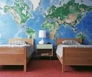
A world map feature wall is definitely one of my all time favourite design ideas. I would love to be able to do something like this in my son's bedroom, which I know he would also be very happy with.

Malibu Mediterranean mediterranean bedroom
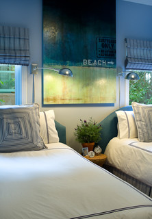
I like this sophisticated beach style, something a little different than your usual beach decor.

twin room traditional bedroom

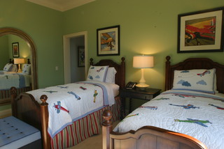
Another fabulous boys room, a nice restful  traditional look. Just what most small men need to unwind !
Studio EA </P><P></P><P>David Hertz Architects Inc. modern kids

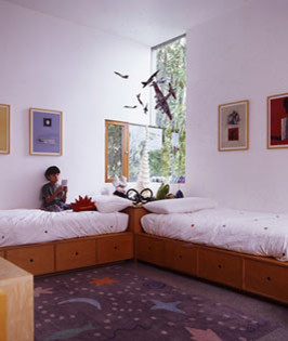
A great way to place these beds,  still leaving plenty of floor space for a great play area & all of that fantastic under bed storage makes for an easy clean up.

Does your kids bedroom match the vision you have for the space as well as fulfil the practical requirements for their age?

Have a great Friday everyone!

CHEERS
Trish xx 


Read More

Garden Delight

Advertisements .

I want to thank you all
for your very warm and
welcoming comments
on my comeback post.
It's good to be back!


Summer days have come to an end but luckily
my vegetable garden is still in full production.
The tomato plants have filled the obelisks that we built.
I grew heirlooms this year and it makes me giddy
to see them ripening.
I've had so many tomatoes, zucchinis and summer squash
that I set up a table on my front porch
and asked my neighbors to come help themselves.
I am delighted to see so many pumpkins and gourdsof all colors, shapes and sizes growing in my garden. I'm sure this may seem strange to some,
but sometimes I think that my purpose
for growing a garden is more for the
happiness

I get from decorating with my harvest
than from the eating of it.
I suppose both serve a similar purpose;
one feeds the body, the other feeds the soul.

Read More

Stylishly Allowing Nature Indoors : Walnut Caster Table

Advertisements .


This charming walnut table comes from realwoodworks1 and is available for purchasing on Etsy. This is a classical case of redesigning a common nature element (such as a tree branch or stem in this particular situation) and transforming it into a glamorous, outstanding furniture piece. The walnut caster table in the photos below has an emotional story behind. The designers rescued it from fire, probably realizing there is more to it than meets the eye. After cleaning it and polishing it, the piece completely changed its appearance and was added functionality. The sophisticated designed can be used as a coffee table and it even has wheels for easy maneuvering. We think it would go great in a living room decorated with more similar nature elements or in a small home office. Where would you place it?

Read More

Minimalist Home Designs are Environmentally Friendly Montecito

Advertisements .

This is a very minimalist design environmentally friendly houses Montecito. Complete Feature With Sustainable by Barton Myers Associates.

I call this house a home that are environmentally friendly. Why is that? This house offers many sustainable features such as highly efficient boilers, photovoltaic panels and Energy-Star rated "cool" roof. photovoltaic panels may have been commonly found in many previous home design, while the Energy-Star rated "cool" roof is something new in home technology. So this house is not going to worry about the energy needs of both day and night with these tools.


Barton Myers Associates designed Montecito Residence in the hills above Montecito, California. stay is designed to take advantage of the striking features of the site, including the majestic oak trees and boulders. The house is divided into two parts. The first part covers the living room, dining room, and kitchen that has a connection to the main outdoor dining and lounge. The second part, more intimate part, contains a bedroom, bathroom and library all of which open up to pages and small outdoor patio. This property also includes a lap-pool and a guest house there.

Montecito Residence in California designed especially without air conditioning, the house is cooled exclusively by cross ventilation. Great operated sectional door glass, sliding doors and windows can be opened and closed quickly adjust to climatic conditions and occupant comfort. " That is why I consider this house as a house in California with continuous full-featured.

Read More

Sunflower Love

Advertisements .

Oh how I love sunflowers! They are such a happy plant. Those pretty, bright yellow heads that magically track the sun

through the day (a little reminder for me to keep my face to the light).I have tried for years to grow them.
I have only been successful once.

I'm not sure why a flower that will thrive in an empty lot will not grow in my yard. Because of this, I have been spotted over the years traipsing through abandoned patches of ground cutting large bouquets. Did you know that people can give you some really strange looks when you're out in an empty field with a pair of clippers?This year I decided to go faux with some realistic looking sunflowers. They're just as pretty but without the mess of hitchhiker bugs, falling pollen, and odd looks from strangers.And I love how they look in my thrift store vintage brown bottles.

Read More

The architectural design of school at grade Japanese-style

Advertisements .

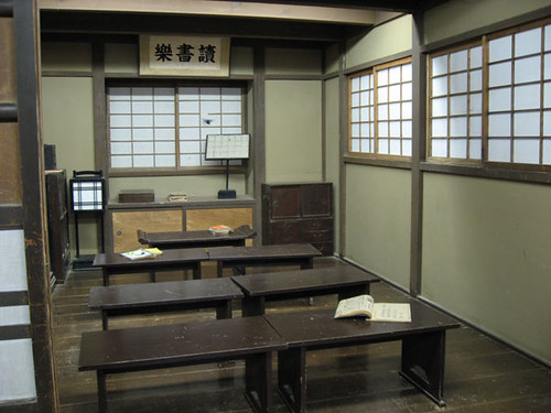
architecture design school

The combination of architectural design of schools and classrooms that are simpler in style sit down and refers to the Japanese forces. And that could make the process of learning to be comfortable.

Read More

Minimalist House Design Dyes Inlet in Bremerton

Advertisements .

This is a minimalist house design Dyes Inlet is located in Bremerton, Seattle, Washington, Dyes Inlet Residence designed by Arkinetic. Built right in front of the lake, this house offers a different atmosphere. Simply beautiful scenery around it is too dear to be missed by homeowners, so the house uses a lot of glass that does not block the view though was in the house.

The Dyes Inlet Residence by Arkinetic:
This custom residence, located eight miles west of Seattle, Washington in Dyes Inlet, consists of the main house, studio / garage, boat storage shed and a boat.
The main house, with central atrium flanked by two wings, is the study of mass and light. North and south wing houses the public space provides a private bedroom. This mass provide privacy from neighbors and offset transparency atrium. Exposure in the atrium is a composite of wood and steel structure, main staircase and bridge that connects the two wings. Encouraging from the north and south faces of each wing is, battered concrete walls that serve as bookends and sandwich two stories of glass and skylights above provide circulation space inside.
A concrete wall datum and link water features studio / garage to the main house. Datum hold in the atrium wall and damaged by a stone chimney that serves as a visual anchor and structural. moved again to the exterior wall, splitting a public terrace with its view of Mt. Rainier from a private bedroom terrace and Koi pond. Terminal from the wall above the datum is a jacuzzi bank.

Home design interior


Studio / garage consisting of parking and work space below with a studio and deck above. The main orientation of the studio is to the south with glass on four sides. Studio deck looking down through the atrium glass wall of the central datum of the main house to the inlet on the outside.

Read More